
I’ve always found most monitoring dashboards… overwhelming. Walls of numbers, graphs everywhere, and somehow you still miss the one server that’s about to fall over.
So when I built the Performance page for Octofleet, I wanted something different. Something that answers the question: “Which machines need my attention right now?”
The Hotspot Matrix
Here’s what we shipped:
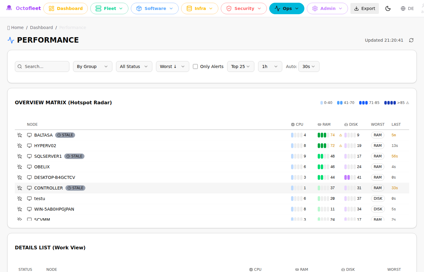
It’s a heat map. But not the fancy kind that requires a PhD to interpret. Each row is a machine. Each column (CPU, RAM, DISK) shows the current load with intensity bars:
| Bars | Range | Meaning |
|---|---|---|
░░░░ |
0-40% | All good, nothing to see |
▒▒░░ |
41-70% | Working normally |
███░ |
71-85% | Getting warm |
████‼ |
>85% | Time to pay attention |
The matrix auto-sorts by worst metric. The machines screaming for help float to the top. You don’t have to hunt for problems — they come to you.
Why Intensity Bars?
I tried progress bars first. You know, the standard “30% filled” kind. They’re fine, but my brain doesn’t process them quickly when scanning a list of 50 machines.
The intensity blocks are different. Your eye catches the pattern instantly:
- One bar lit? It’s idle.
- All bars lit with a red tint? Something’s wrong.
It’s the difference between reading numbers and seeing state. When you’re managing 10+ endpoints, that fraction of a second matters.
The Dashboard Widget
The same visualization now lives on the main dashboard too:
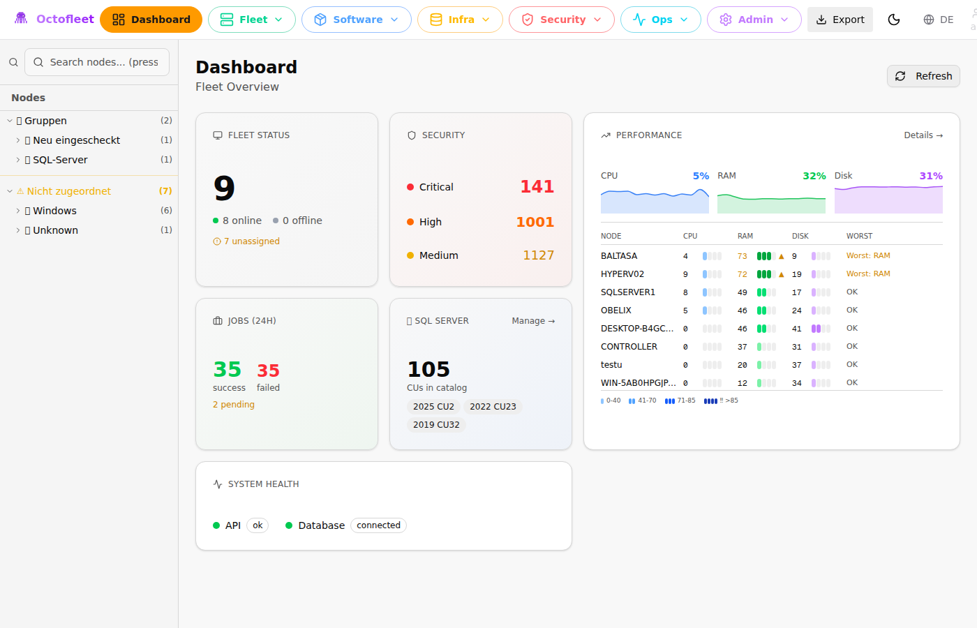
Top 8 machines by worst metric, always visible. Combined with the fleet-wide CPU/RAM/DISK sparklines above, you get a complete picture in one glance.
Filtering & Grouping
The full /performance page adds more controls:
- Search — Find specific hostnames
- Group by — OS, Device Group, or Tags
- Sort — By worst metric, CPU, RAM, or DISK
- Only Alerts — Show only machines above threshold
- Time Range — 15min, 1h, 6h, 24h
Clicking any row opens a side panel with 60-minute trend charts and quick actions (view logs, jump to Live View, open node details).
The Technical Bit
For those who care about implementation:
The backend aggregates metrics via TimescaleDB continuous aggregates. The /api/v1/metrics/summary endpoint returns current values, while /api/v1/metrics/timeseries provides historical data for the sparklines.
The agents report metrics every 60 seconds. Low overhead, but frequent enough to catch spikes.
Frontend is React + Tailwind. The heat bars are just four div elements with conditional coloring. Nothing fancy — the simplest solution that works.
Try It
If you’re running Octofleet, just pull the latest and hit /performance. If you’re not, maybe this is a good excuse to check it out.
The whole thing is MIT licensed. Use it, fork it, tell me if something sucks.
Currently tracking 9 endpoints across Windows Server, Windows 11, and Linux. The dashboard has become my default browser tab. I might have a problem.